Welcome to my portfolio! I'm a data analyst passionate about turning data into actionable insights using R, SQL, Tableau, and Google Sheets. Explore my projects to see how I solve real-world problems with data.
Projects
Bitcoin vs. Gold: Safe Haven Showdown (2015-2025)
A data analysis project comparing Bitcoin and gold as safe haven assets over 10 years. Data was sourced from Blockchain.com (Bitcoin) and Alpha Vantage (GLD ETF for gold), cleaned in Google Sheets, processed in BigQuery, analyzed in R, and visualized in Tableau.
- GitHub Repository
- Tableau Dashboard
- HTML Report
- Raw Dataset (CSV)
- Processed Dataset (CSV)
- Analyzed Dataset (CSV)
BigQuery Processing
Used BigQuery to process data, calculating weekly returns for Bitcoin and gold. Below are the SQL queries used:
Query 1: Calculate Weekly Returns
SELECT
  Date,
  Bitcoin_Price,
  Gold_Price,
  (Bitcoin_Price / LAG(Bitcoin_Price) OVER (ORDER BY Date) - 1) * 100 AS Bitcoin_Weekly_Return,
  (Gold_Price / LAG(Gold_Price) OVER (ORDER BY Date) - 1) * 100 AS Gold_Weekly_Return
FROM `bitcoin-vs-gold-project-10y.safe_haven_data.raw_data`
ORDER BY Date;
Query 2: Create Processed Table
CREATE OR REPLACE TABLE `bitcoin-vs-gold-project-10y.safe_haven_data.processed_data_sorted` AS
SELECT
  Date,
  Bitcoin_Price,
  Gold_Price,
  (Bitcoin_Price / LAG(Bitcoin_Price) OVER (ORDER BY Date) - 1) * 100 AS Bitcoin_Weekly_Return,
  (Gold_Price / LAG(Gold_Price) OVER (ORDER BY Date) - 1) * 100 AS Gold_Weekly_Return
FROM `bitcoin-vs-gold-project-10y.safe_haven_data.raw_data`
ORDER BY Date;
Query 3: View Processed Data
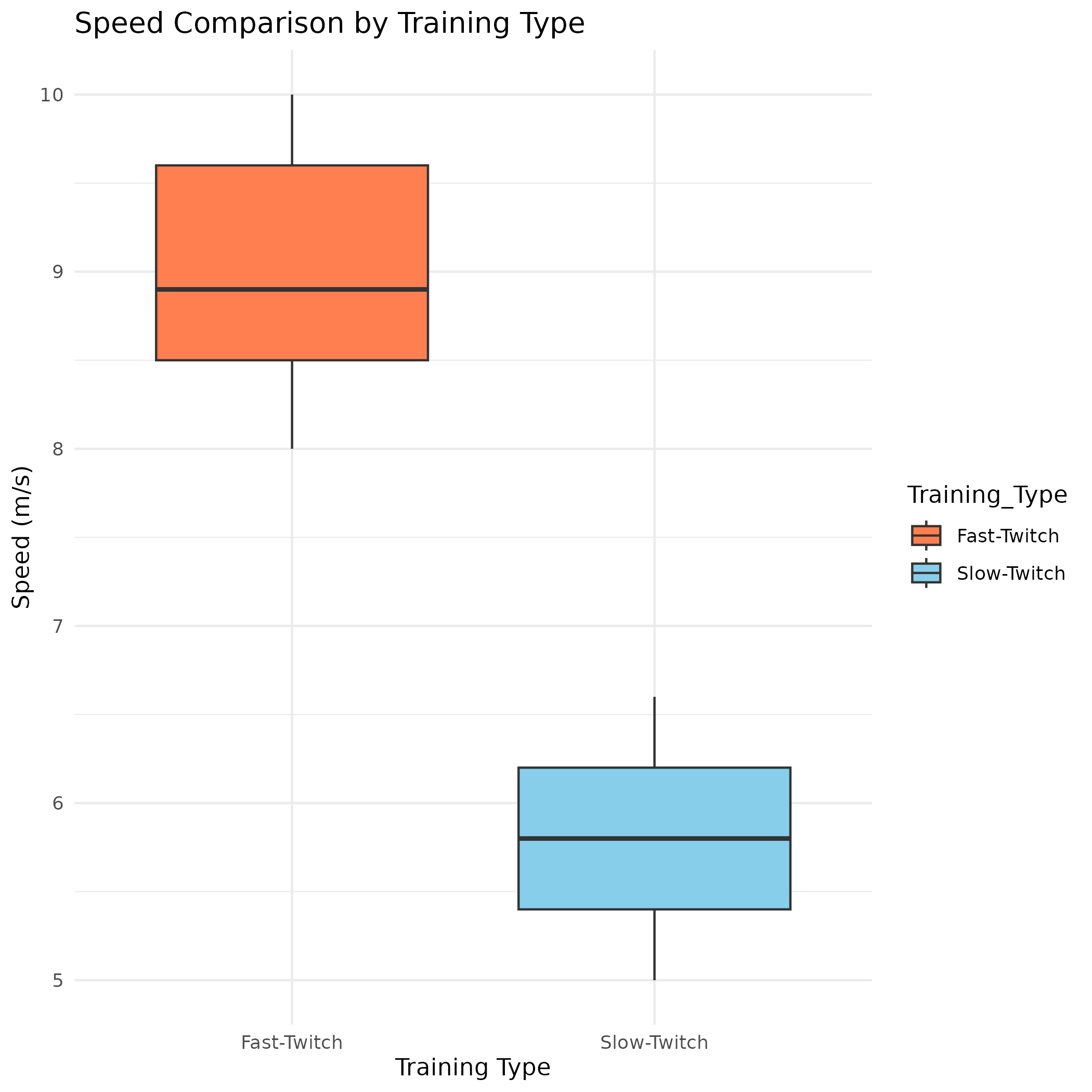
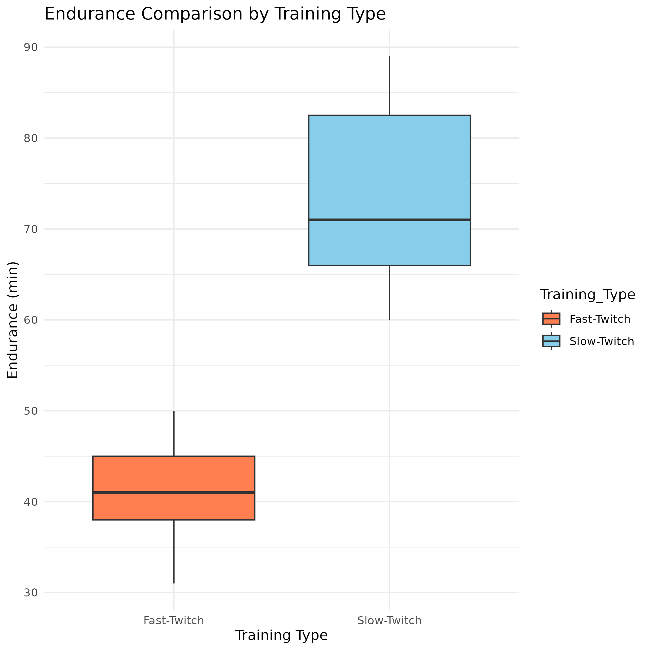
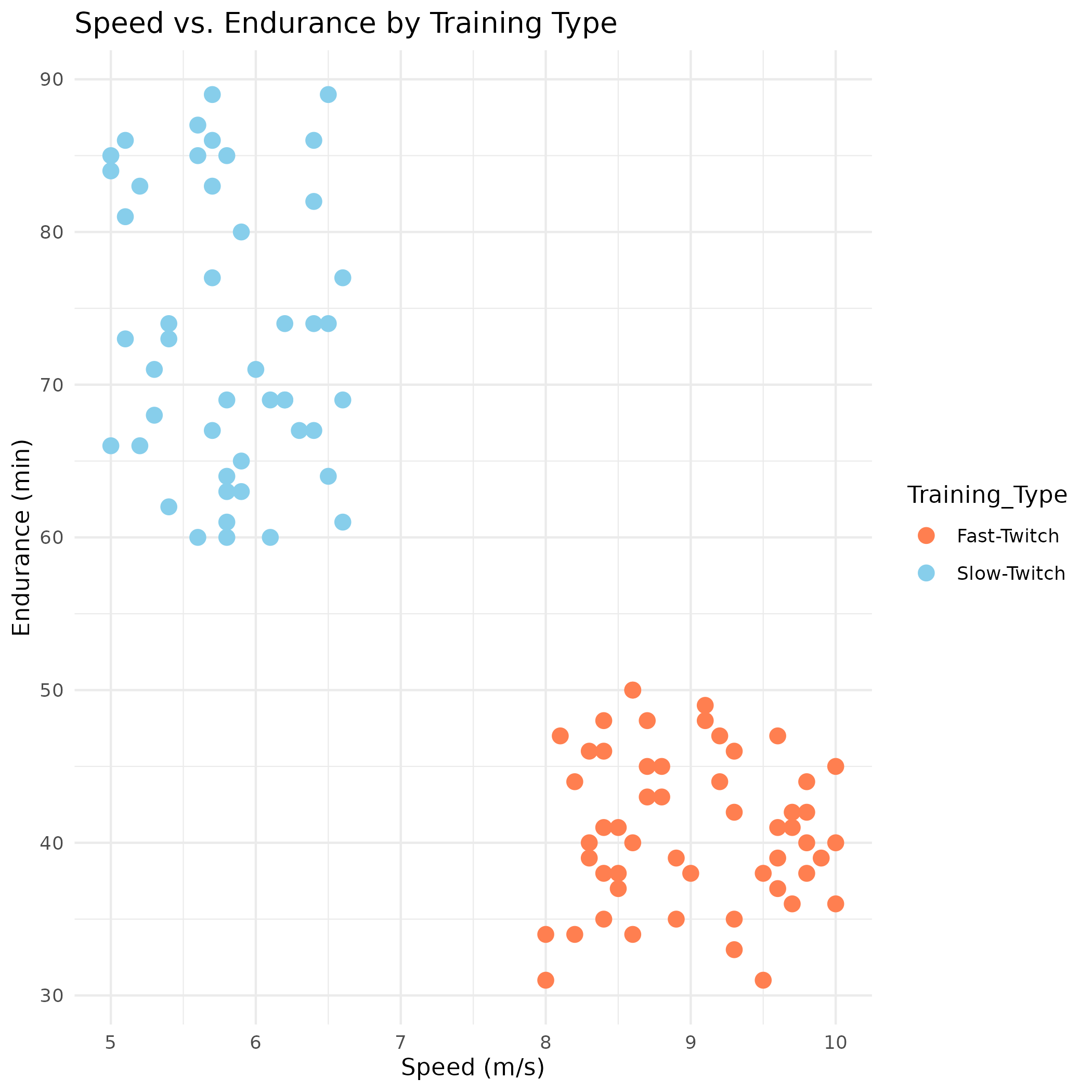
SELECT * FROM safe_haven_data.processed_data_sortedAthlete Training Analysis: Fast-Twitch vs. Slow-Twitch
Analyzed the impact of training focus (fast-twitch vs. slow-twitch muscle fibers) on speed, endurance, and recovery time for 100 athletes using R, Tableau, Google Sheets, and BigQuery. Includes statistical analysis, visualizations, and an interactive dashboard.
View Speed Comparison Boxplot (PNG)
View Endurance Comparison Boxplot (PNG)
Cyclistic Bike-Share Analysis
Capstone project for the Google Data Analytics Certificate. Analyzed bike-share data to compare casual riders and annual members, proposing marketing strategies.
Online Retail Customer Retention Analysis
Analyzed customer retention for an online retail business, identifying patterns and proposing strategies to improve loyalty.
Stablecoin Analysis Project
Analyzed the stability of four stablecoins (USDT, USDC, DAI, TUSD) using R, SQL, and Tableau Public. Includes data cleaning, statistical analysis, and interactive visualizations.
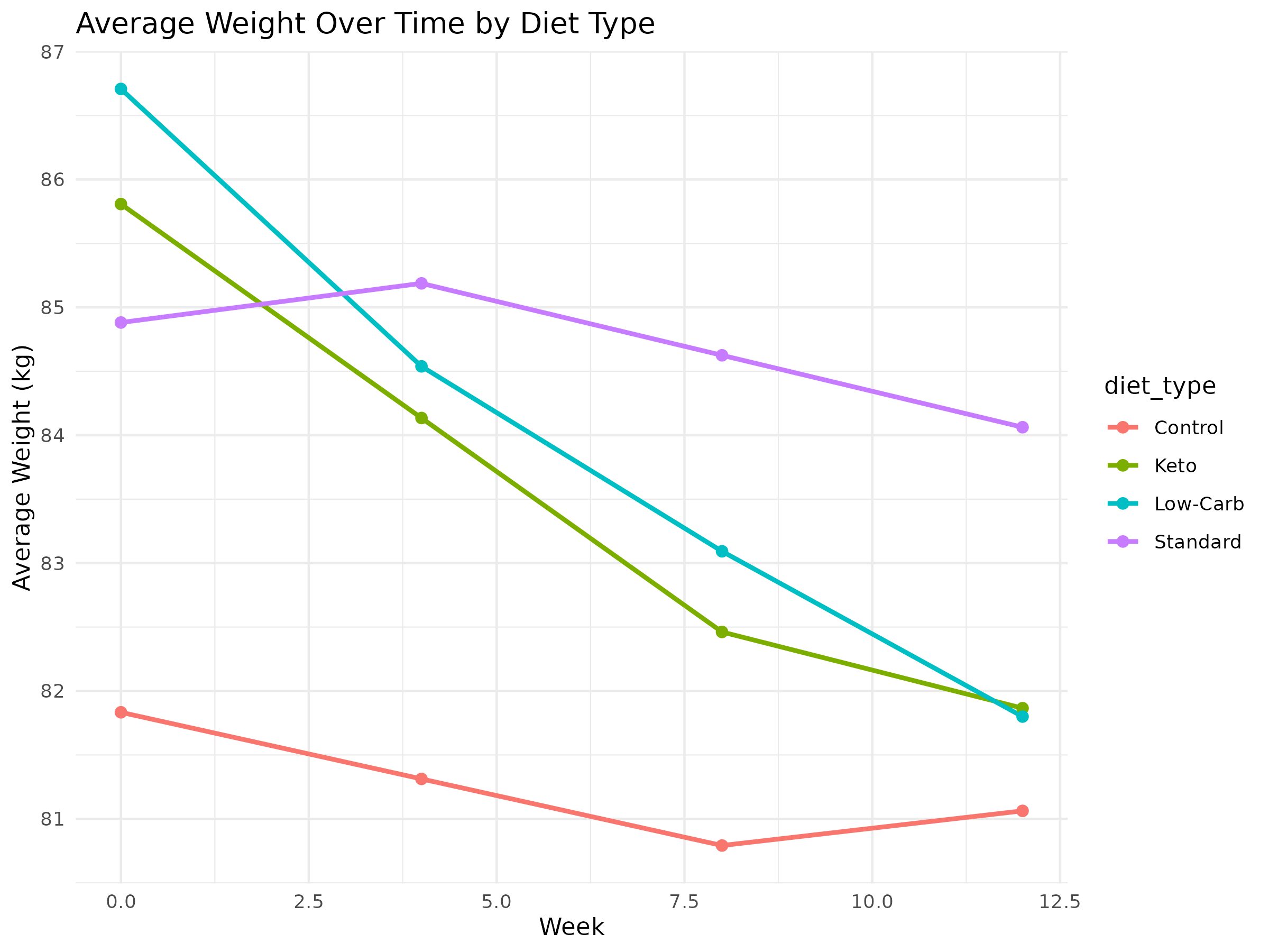
Low Insulin Diet Study
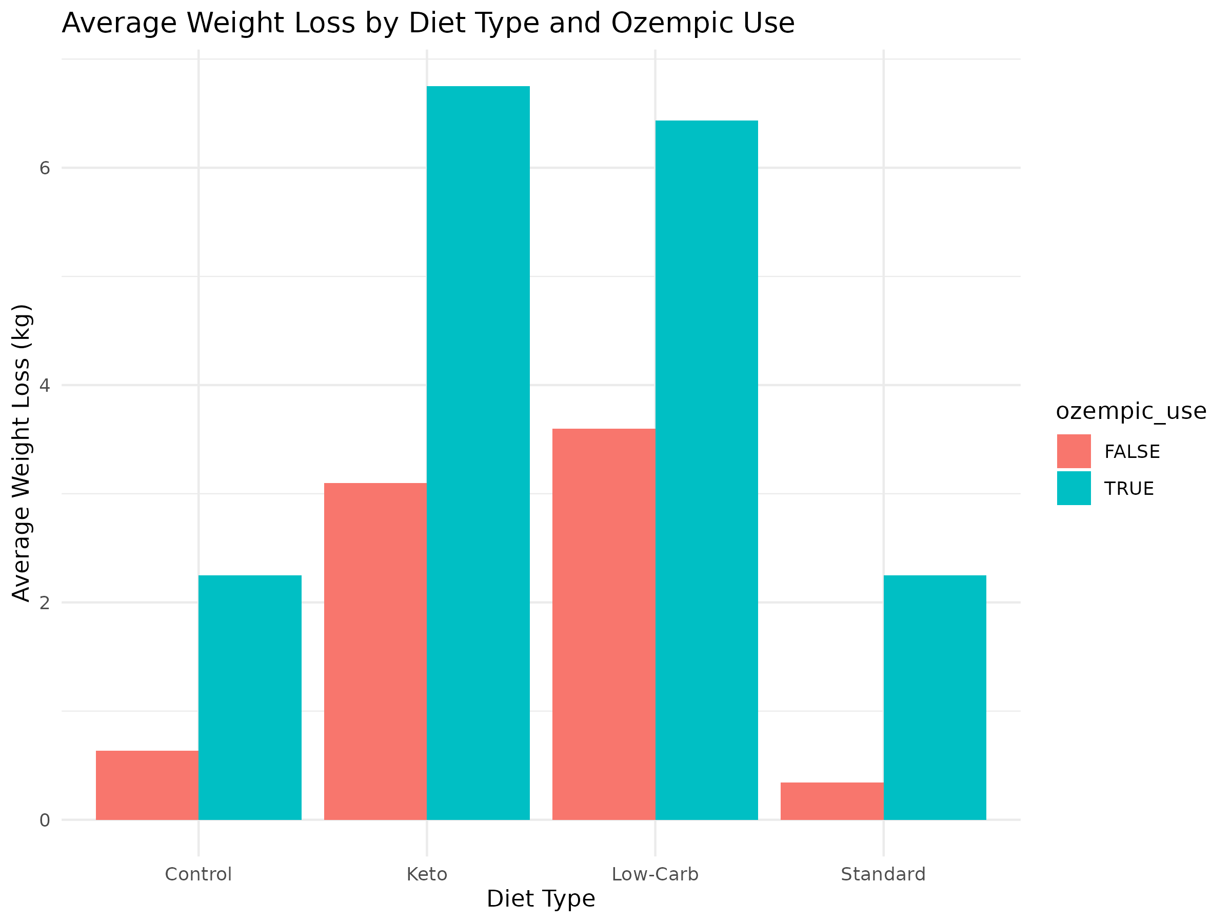
Analyzed the effects of four diet types (Keto, Low-Carb, Standard, Control) and Ozempic on weight loss, HOMA-IR, and fasting insulin over 12 weeks using R, SQL, and Tableau Public.
- GitHub Repository
- View R Markdown Report (HTML)
- Download Dataset (CSV)
- View Weight Over Time Chart (PNG)
- View Weight Loss Bar Chart (PNG)
- View Visualizations on Tableau Public
Data Cleaning with BigQuery
Used BigQuery to clean and preprocess the dataset for the Low Insulin Diet Study, handling missing values and ensuring data consistency.
Filtering Invalid Data
Removed invalid entries by filtering out negative weights and standardizing missing values in the weight_kg column.
SELECT
  participant_id,
  diet_type,
  week,
  IFNULL(weight_kg, 0) AS weight_kg,
  homa_ir,
  fasting_insulin
FROM your_project.your_dataset.low_insulin_diet_data
WHERE weight_kg >= 0;
See the cleaned dataset: Low Insulin Diet Study Dataset.
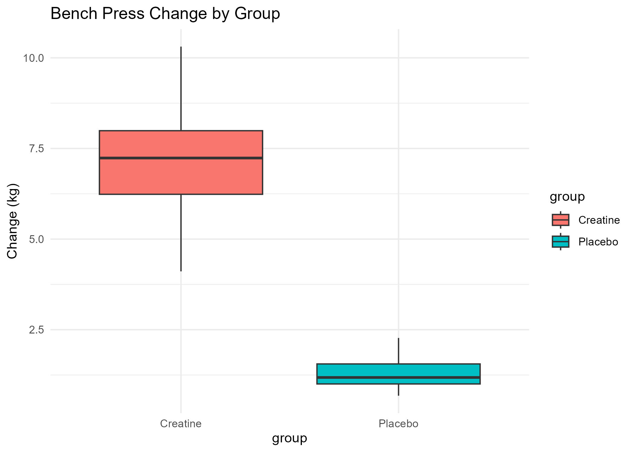
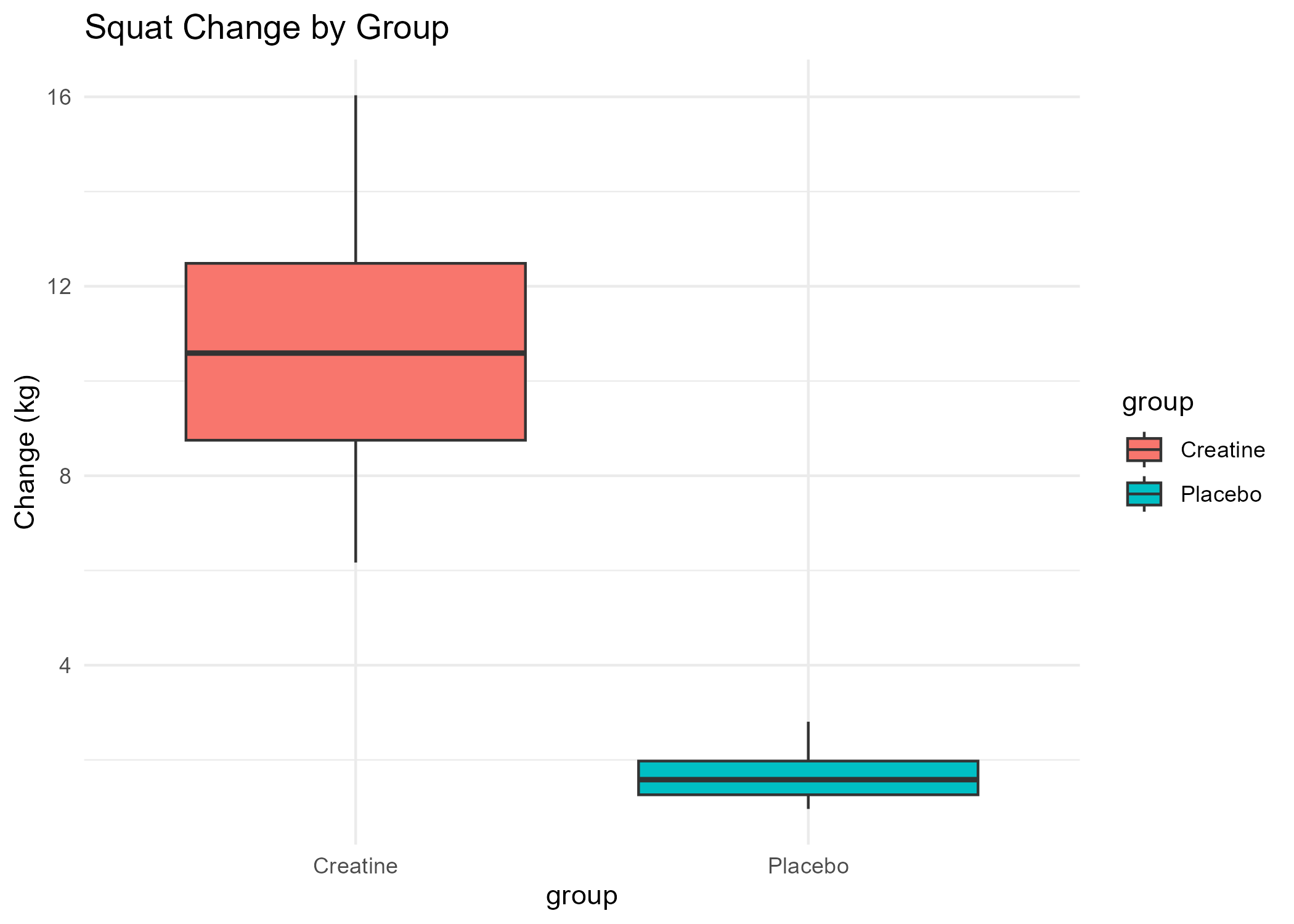
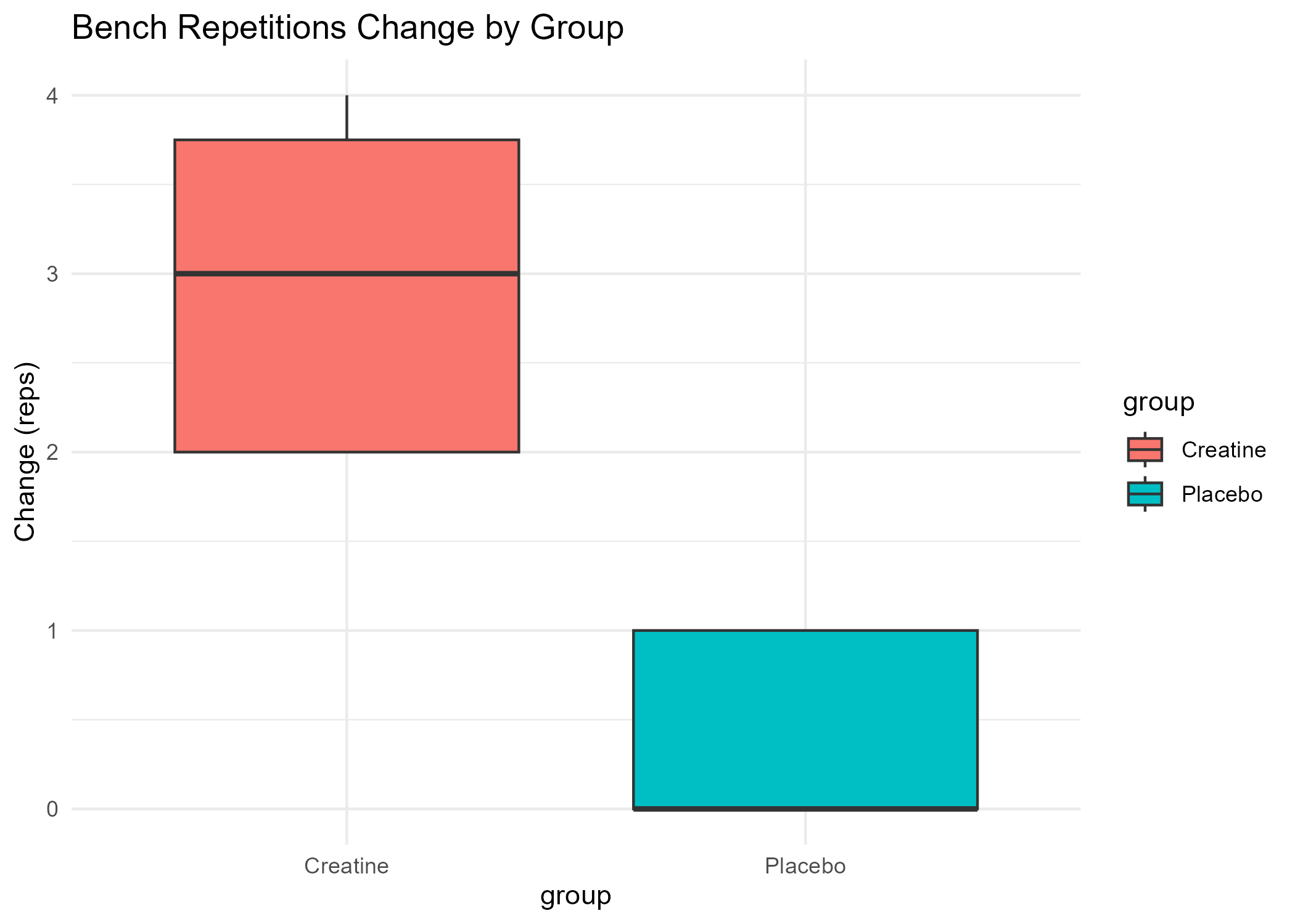
Creatine Study Report
Analyzed the effects of creatine supplementation on strength, resistance training, and cognitive performance using R, Google Sheets, and BigQuery for data cleaning and analysis.
- GitHub Repository
- View R Markdown Report (HTML)
- Download Dataset (CSV)
- View Bench Press Boxplot (PNG)
- View Squat Boxplot (PNG)
- View Repetitions Boxplot (PNG)
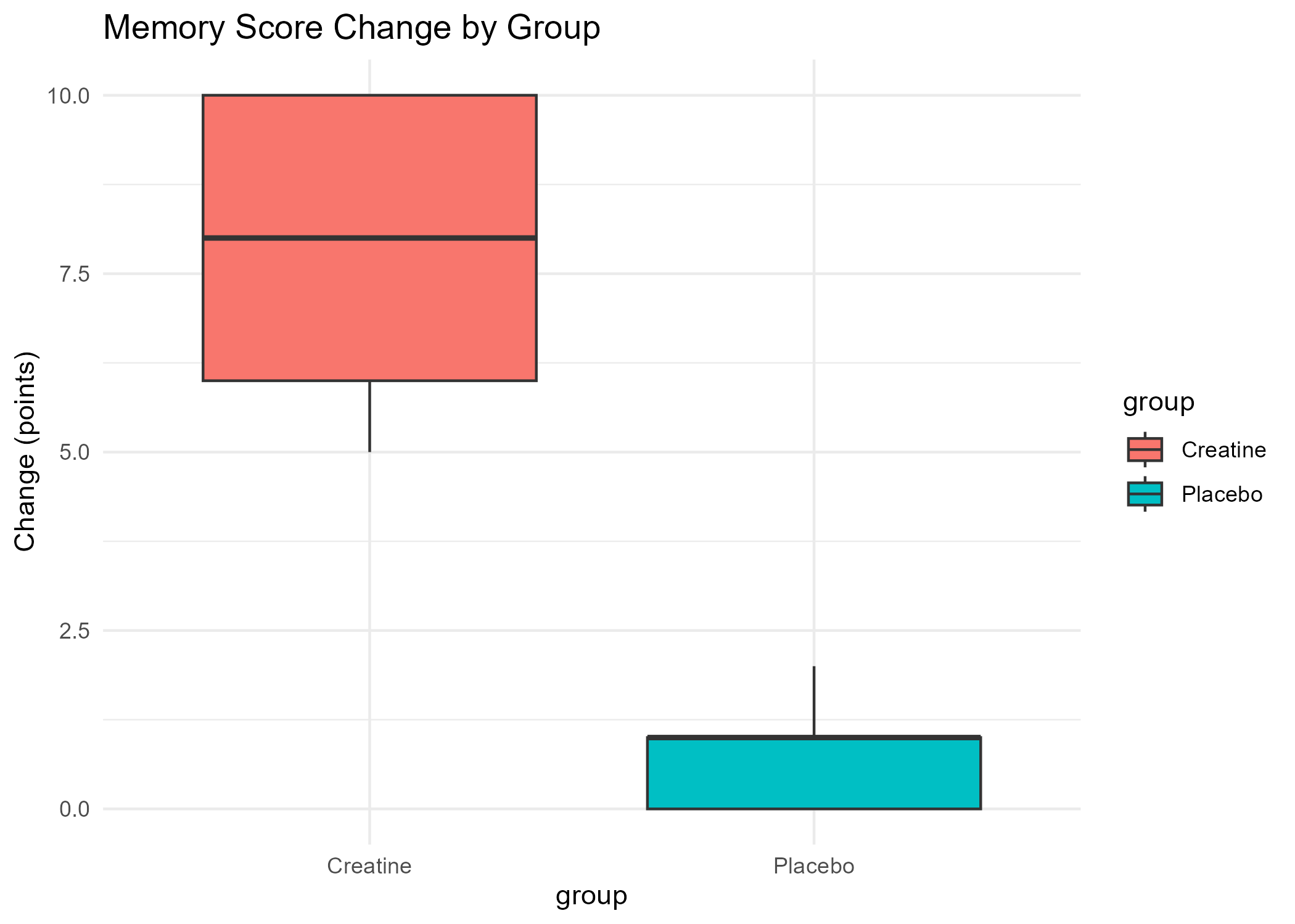
- View Memory Score Boxplot (PNG)
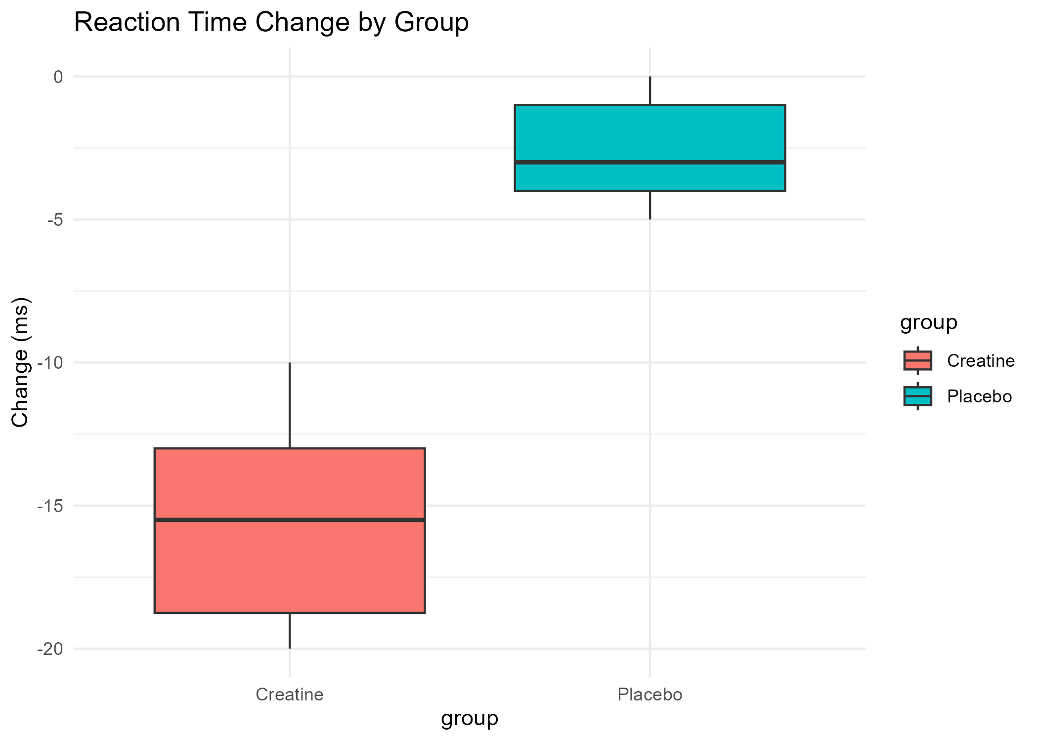
- View Reaction Time Boxplot (PNG)
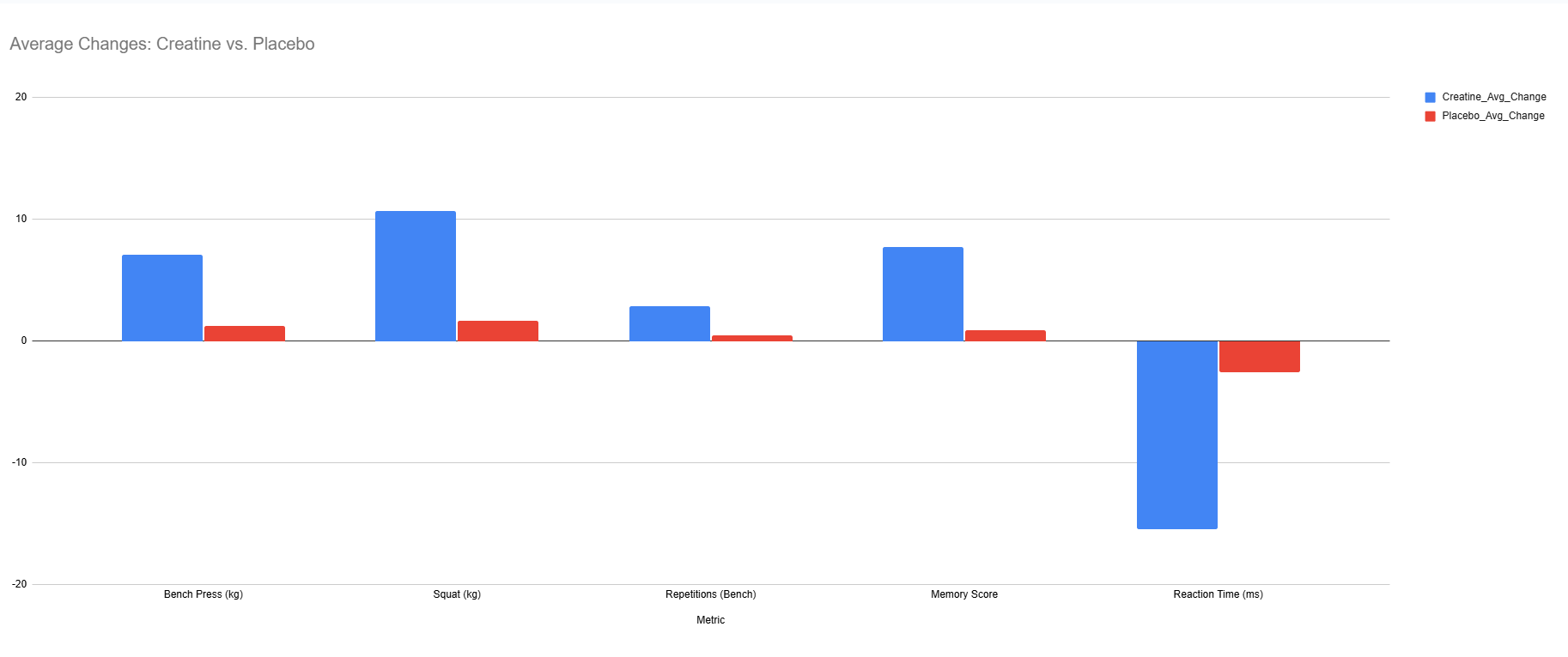
Google Sheets Visualization
A chart created in Google Sheets to visualize data trends during initial data exploration for the Creatine Study.
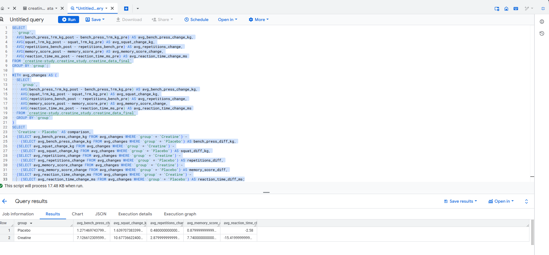
Data Cleaning with BigQuery
Used BigQuery to clean and preprocess the dataset for the Creatine Study, handling missing values and ensuring data consistency. Below are example SQL queries used for analysis and cleaning, along with a screenshot of the BigQuery interface.
Example: Creatine Study - Calculate Average Changes and Group Differences
Calculated the average change in metrics (bench press, squat, repetitions, memory score, reaction time) for each group (Creatine and Placebo), and computed the differences between groups to quantify the effect of creatine supplementation.
Query 1: Average Changes by Group
SELECT
  group,
  AVG(bench_press_1rm_kg_post - bench_press_1rm_kg_pre) AS avg_bench_press_change_kg,
  AVG(squat_1rm_kg_post - squat_1rm_kg_pre) AS avg_squat_change_kg,
  AVG(repetitions_bench_post - repetitions_bench_pre) AS avg_repetitions_change,
  AVG(memory_score_post - memory_score_pre) AS avg_memory_score_change,
  AVG(reaction_time_ms_post - reaction_time_ms_pre) AS avg_reaction_time_change_ms
FROM your_project.your_dataset.creatine_data
GROUP BY group;
Query 2: Differences Between Creatine and Placebo Groups
WITH avg_changes AS (
  SELECT
    group,
    AVG(bench_press_1rm_kg_post - bench_press_1rm_kg_pre) AS avg_bench_press_change_kg,
    AVG(squat_1rm_kg_post - squat_1rm_kg_pre) AS avg_squat_change_kg,
    AVG(repetitions_bench_post - repetitions_bench_pre) AS avg_repetitions_change,
    AVG(memory_score_post - memory_score_pre) AS avg_memory_score_change,
    AVG(reaction_time_ms_post - reaction_time_ms_pre) AS avg_reaction_time_change_ms
  FROM your_project.your_dataset.creatine_data
  GROUP BY group
)
SELECT
  'Creatine - Placebo' AS comparison,
  (SELECT avg_bench_press_change_kg FROM avg_changes WHERE group = 'Creatine') -
    (SELECT avg_bench_press_change_kg FROM avg_changes WHERE group = 'Placebo') AS bench_press_diff_kg,
  (SELECT avg_squat_change_kg FROM avg_changes WHERE group = 'Creatine') -
    (SELECT avg_squat_change_kg FROM avg_changes WHERE group = 'Placebo') AS squat_diff_kg,
  (SELECT avg_repetitions_change FROM avg_changes WHERE group = 'Creatine') -
    (SELECT avg_repetitions_change FROM avg_changes WHERE group = 'Placebo') AS repetitions_diff,
  (SELECT avg_memory_score_change FROM avg_changes WHERE group = 'Creatine') -
    (SELECT avg_memory_score_change FROM avg_changes WHERE group = 'Placebo') AS memory_score_diff,
  (SELECT avg_reaction_time_ms_post - reaction_time_ms_pre FROM avg_changes WHERE group = 'Creatine') -
    (SELECT avg_reaction_time_ms_post - reaction_time_ms_pre FROM avg_changes WHERE group = 'Placebo') AS reaction_time_diff_ms;
View BigQuery Screenshot (PNG)
See the cleaned dataset: Creatine Study Dataset.
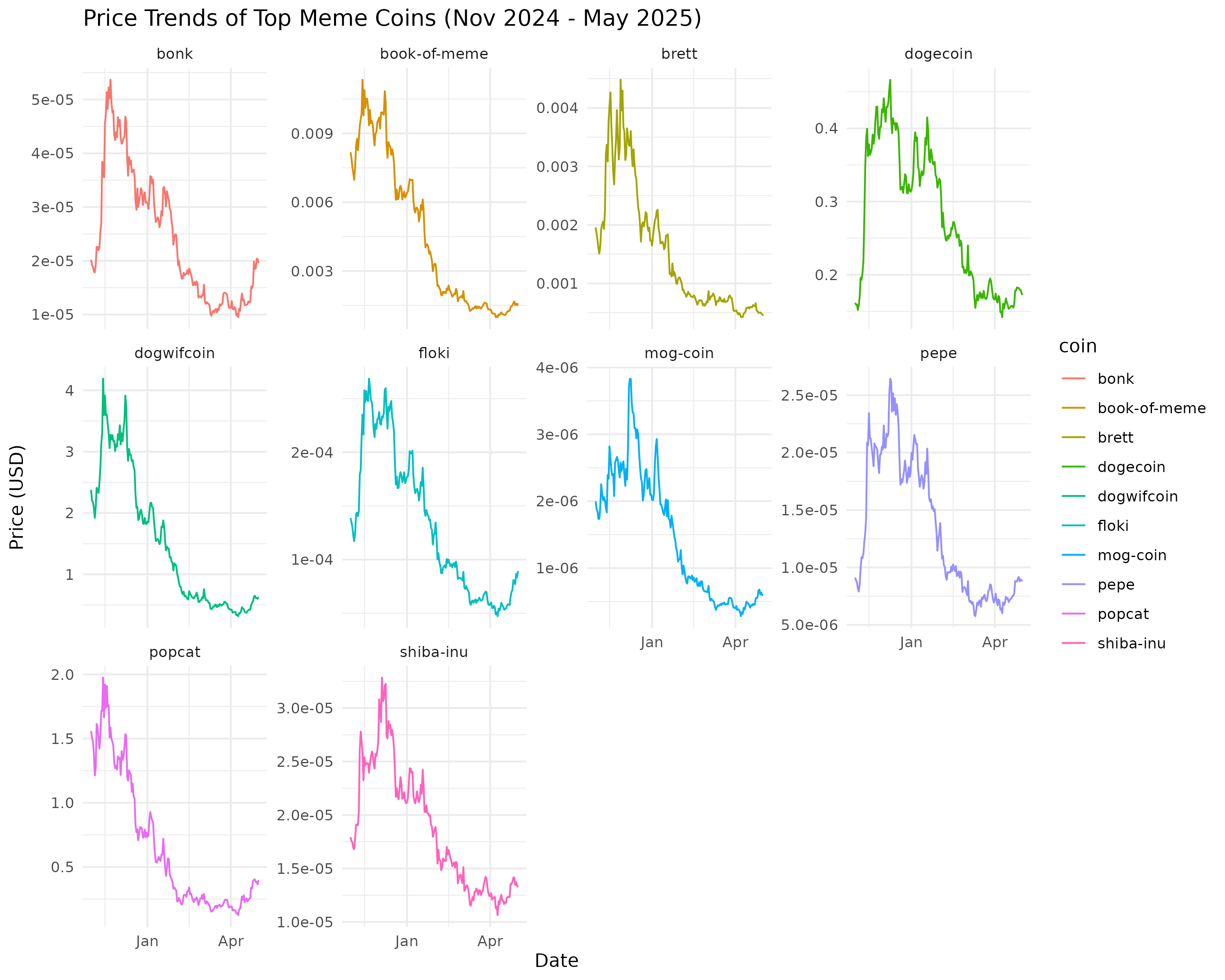
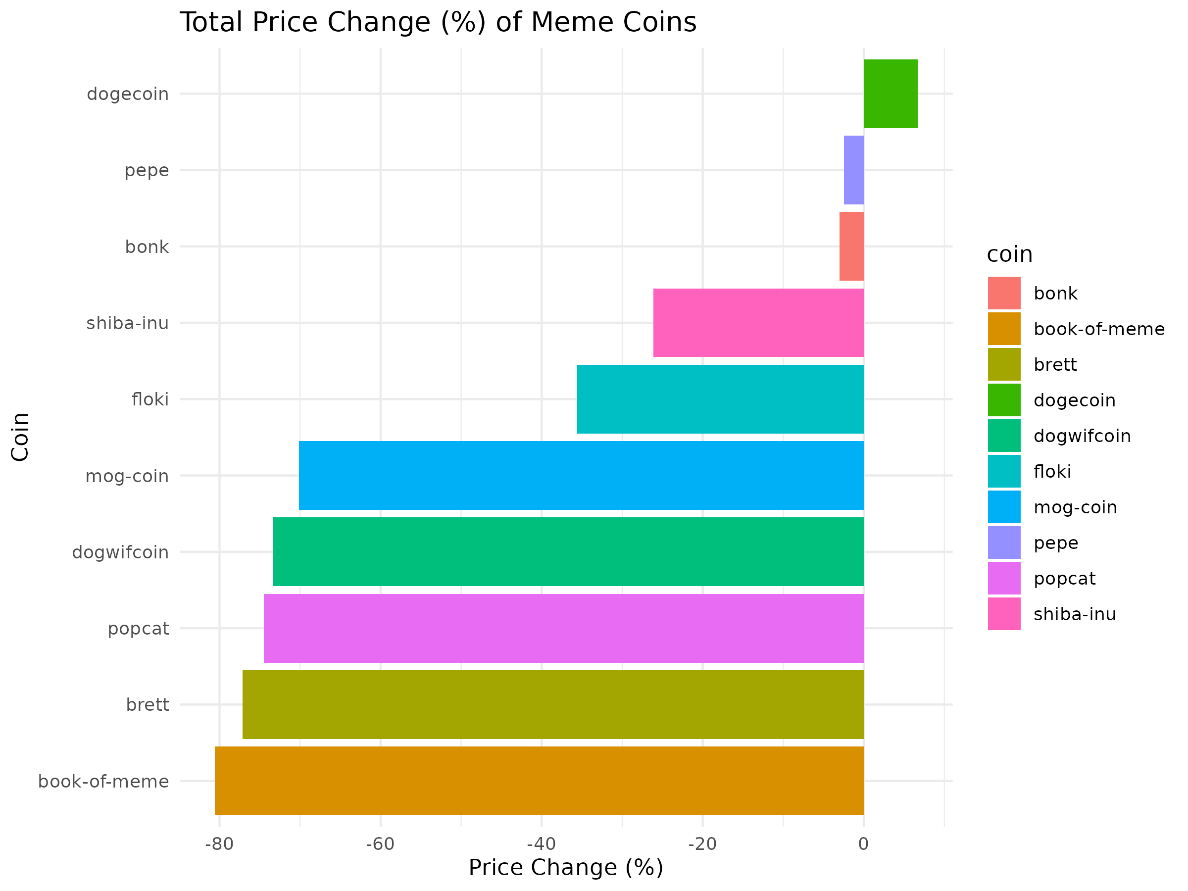
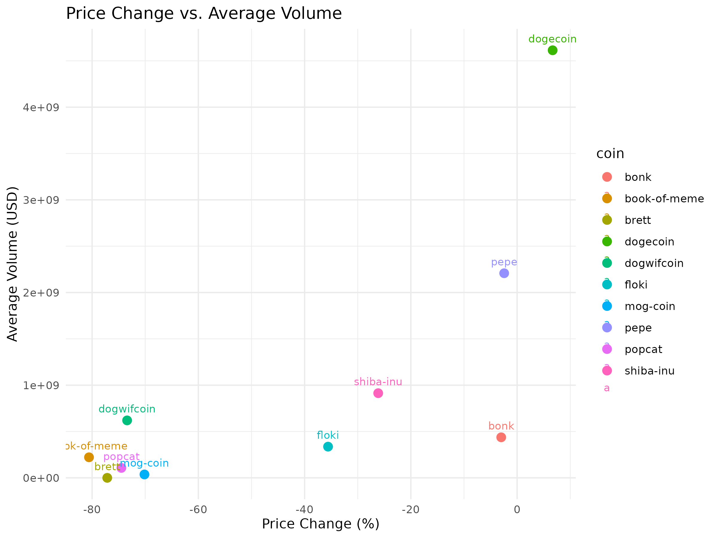
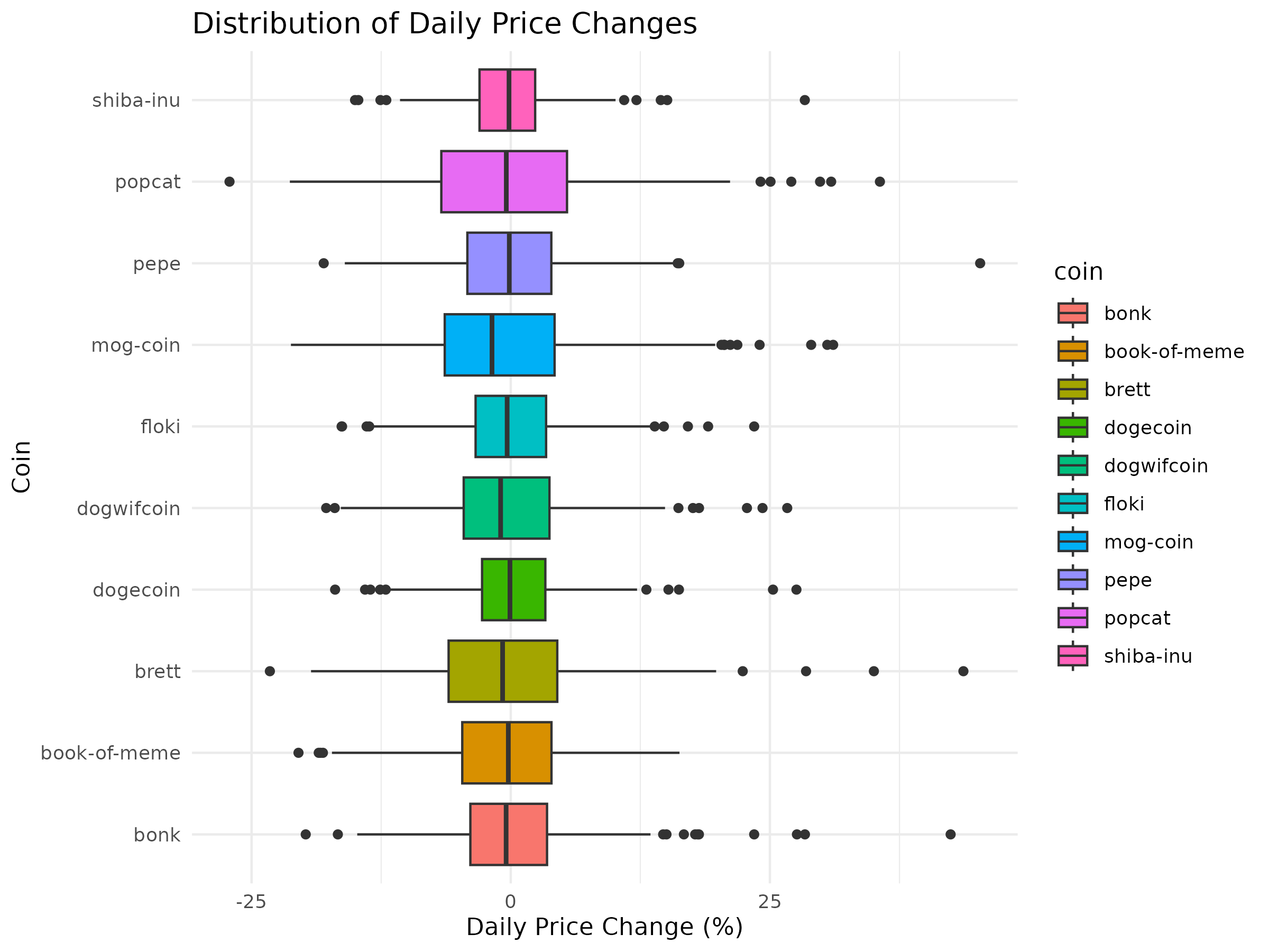
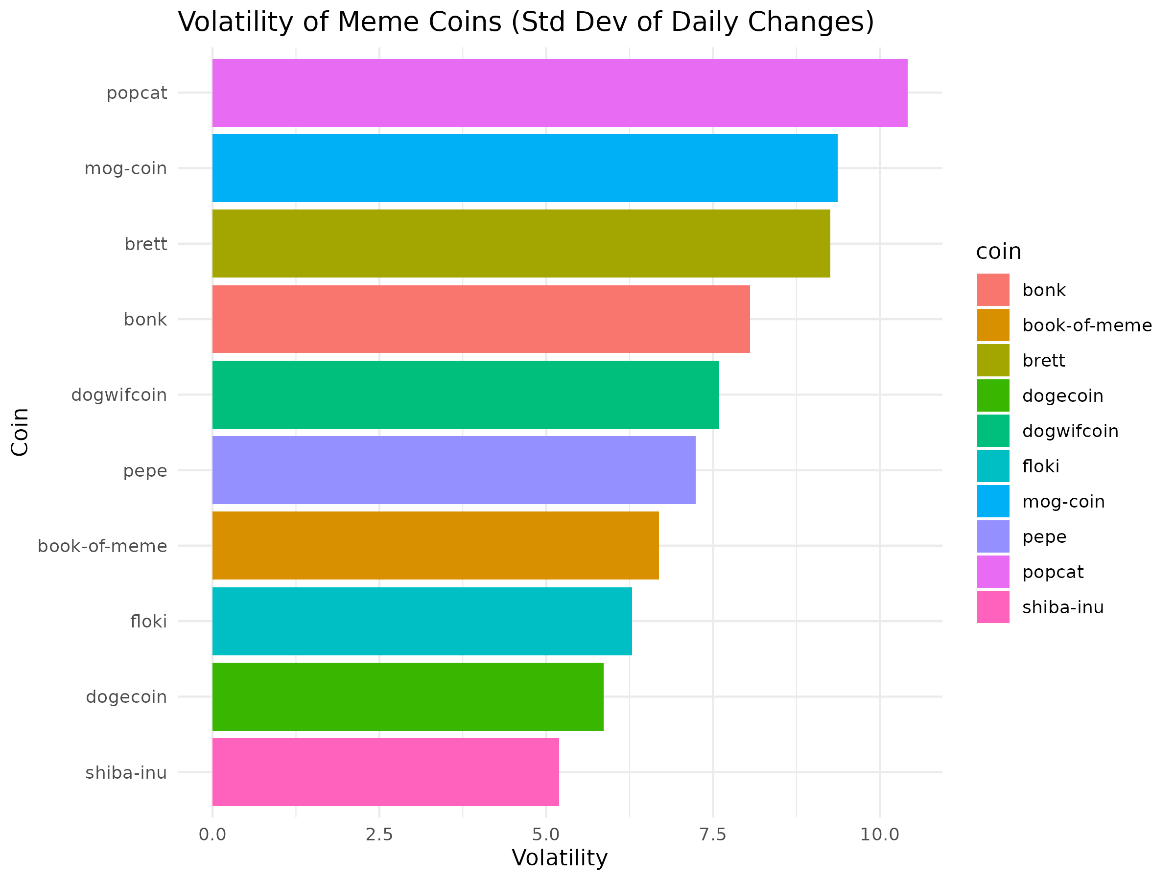
Meme Coins Performance Tracker
Analyzed the performance of top meme coins (e.g., Dogwifcoin, Floki, Pepe) from November 2024 to May 2025 using Python, SQL, R, and Tableau. Includes data fetching, processing, analysis, visualizations, and investment recommendations.
Download Results Dataset (CSV)
View Price Change Bar Chart (PNG)
View Price vs. Volume Scatter Plot (PNG)
View Daily Change Boxplot (PNG)
View Volatility Bar Chart (PNG)
Data Processing with BigQuery
Used BigQuery to clean and process meme coin data, removing duplicates and calculating daily price changes. Below are the SQL queries used for data processing.
Query 1: Remove Duplicates and Clean Data
-- Remove duplicates
CREATE OR REPLACE TABLE `meme_coins_dataset.meme_coins_cleaned` AS
SELECT DISTINCT coin, date, price_usd, volume_usd
FROM `meme_coins_dataset.meme_coins_raw`;
Query 2: Calculate Daily Price Changes
-- Calculate daily price changes
CREATE OR REPLACE TABLE `meme_coins_dataset.meme_coins_processed` AS
SELECT
    coin,
    date,
    price_usd,
    volume_usd,
    LAG(price_usd) OVER (PARTITION BY coin ORDER BY date) AS previous_price,
    SAFE_DIVIDE(price_usd - LAG(price_usd) OVER (PARTITION BY coin ORDER BY date),
                LAG(price_usd) OVER (PARTITION BY coin ORDER BY date)) * 100 AS daily_price_change_pct
FROM `meme_coins_dataset.meme_coins_cleaned`
ORDER BY coin, date;
Scripts
View Data Fetching Script (Python)
DeFi TVL Explorer
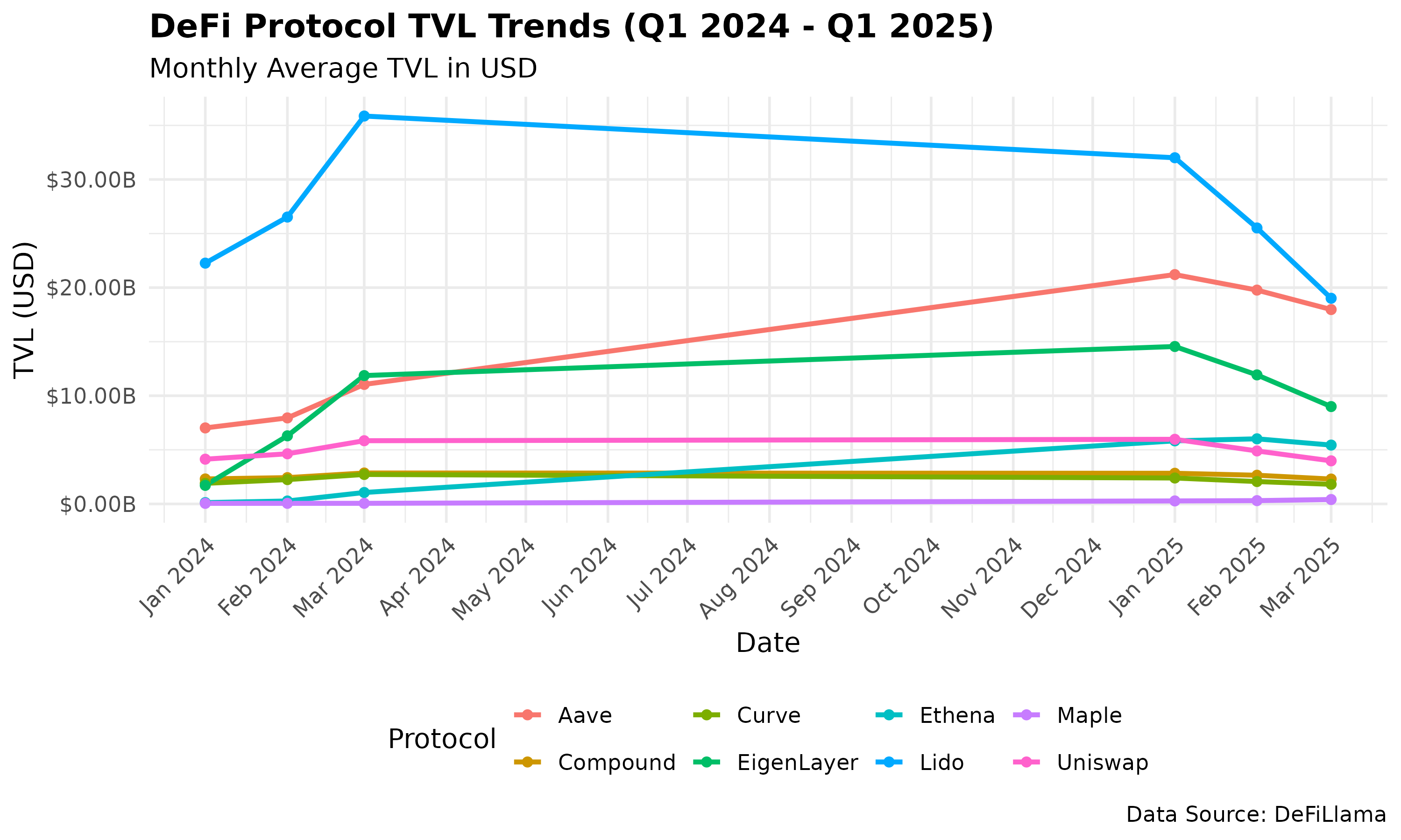
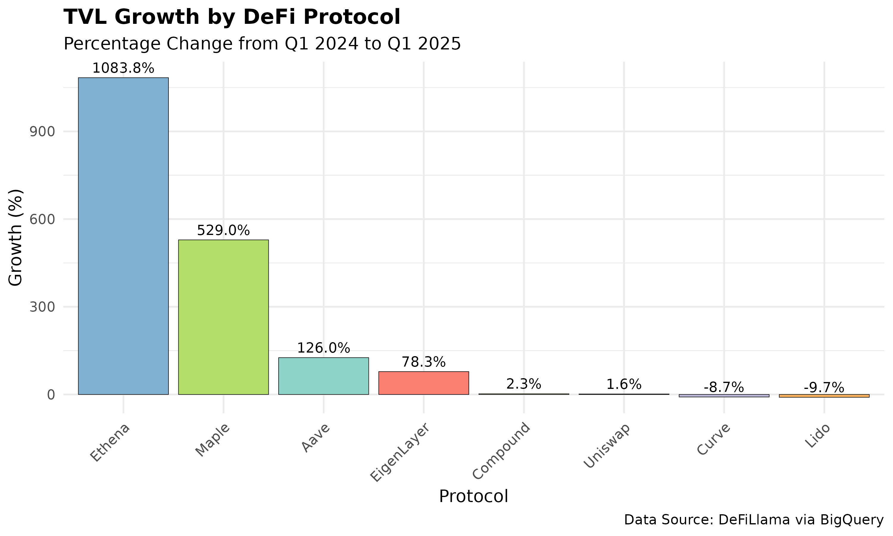
Analyzed Total Value Locked (TVL) growth for eight DeFi protocols (Uniswap, Aave, Maple, Compound, Lido, EigenLayer, Curve, Ethena) from Q1 2024 to Q1 2025 to identify the fastest-growing protocol. Used Python for data fetching, Google Sheets for cleaning, BigQuery for growth calculations, R for visualizations, and Tableau for an interactive dashboard.
- GitHub Repository
- Tableau Dashboard
- Project Report (HTML)
- Growth Results Dataset (CSV)
- Cleaned Dataset (CSV)
- Raw Dataset (CSV)
- TVL Trends Plot (PNG)
- Growth Bar Plot (PNG)
- Python Notebook
- SQL Query
- R Script
Key Findings
- Ethena led with 1083.8% TVL growth, driven by its yield-bearing USDe stablecoin and institutional investments.
- Uniswap remained stable (1.57% growth), reflecting its dominance as a decentralized exchange.
- Lido saw a 9.71% TVL decline, likely due to a Bybit hack and competition from EigenLayer.
BigQuery Processing
Used BigQuery to calculate TVL growth percentages for each protocol. Below is the SQL query used:
Query: Calculate TVL Growth Percentages
SELECT
    Protocol,
    (MAX(CASE WHEN Date = '2025-03-31' THEN TVL_USD END) /
     MAX(CASE WHEN Date = '2024-03-31' THEN TVL_USD END) - 1) * 100 AS growth_percentage
FROM `defi-tvl-project.defi_data.cleaned_defi_tvl`
WHERE Date IN ('2024-03-31', '2025-03-31')
GROUP BY Protocol
ORDER BY growth_percentage DESC;
Contact
Connect with me on LinkedIn or email me at alexandergs0x@protonmail.com.